Identifying Weaknesses and strengths in an IELTS Graph Response: Analysis
IELTS Task 1: Response Analysis
Comparing Band 5.0 vs Band 8.0+ Responses
The Task
The graph below gives information about changes in the birth and death rates in New Zealand between 1901 and 2101. Write a report for a university lecturer describing the information shown below.
(Refer to the "Birth and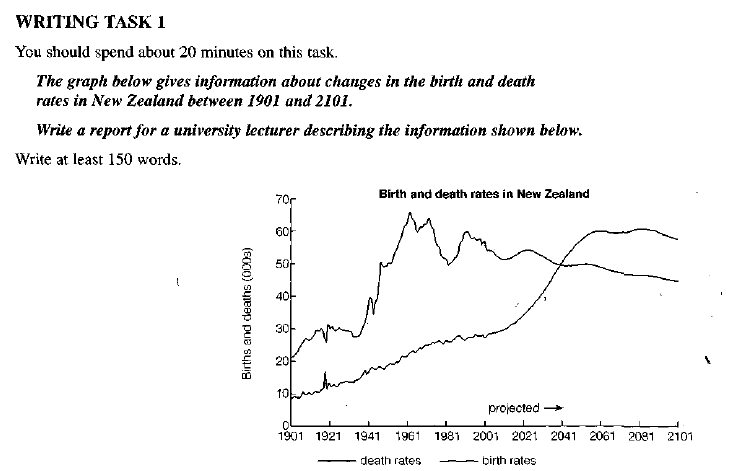 death rates in New Zealand" graph provided)
Sample A: Weak Response Low Band Score
The graph gives information about changes in the birth and death rates in New Zealand between 1901 and 2101.
In 1901, the birth rate was 20,000 and the death rate was 9,000. In 1961 the birth rate reached a peak of 66,000 while the death rate was 23,000. In 2001 there were 55,000 births and 38,000 deaths, and in 2061 there were 60,000 deaths and 45,000 births.
At the end of the period there were 58,000 deaths and 45,000 births. Both the birth and death rates changed between 1901 and 2101. Perhaps this was because a lot of people did not want to have children.
(105 Words)
Why is this a low score? (Click to expand)
- Underlength: Only 105 words (minimum required is 150).
- Copied Intro: The introduction is copied word-for-word from the prompt.
- No Comparisons: It merely lists figures without comparing them.
- Ignored Future Tense: Fails to use future tense for the projected years (2021–2101).
- Inappropriate Opinion: The conclusion speculates on reasons ("people did not want children"), which is not allowed in Task 1.
Sample B: Exemplary Response High Band Score
The presented graph showcases the alterations in birth and death rates in New Zealand from 1901 up to 2101, including projected trends. Commencing with the former, it is apparent that throughout the indicated period, the birth rate consistently exceeded the death rate. The rate began at a modest 20,000 and spiked at its zenith in 1961... [See full text in lesson]... These opposing trends suggest that the death rate may surpass the birth rate in approximately 2041.
Overall, this graph highlights the noteworthy shifts in birth and death rates in New Zealand, particularly the stark contrast between the two.
(164 Words)
Why is this a high score? (Click to expand)
- Paraphrasing: Effectively rewords the prompt ("presented graph showcases," "alterations").
- Comparisons: Highlights differences ("consistently exceeded," "opposing trends," "surpass").
- Clear Overview: Identifies general trends without listing every single number.
- Future Tense: Correctly uses projection language ("is projected to," "anticipated to stabilize").
- Vocabulary: Uses precise terms like "zenith," "oscillated," and "dwindling."
Key Takeaway: To score highly, you must paraphrase the intro, group data logically, and avoid giving your own opinions.